
Labeling all or some of your data with text can help tell a story — even when your graph is using other cues like color and size. ggplot has a couple of built-in ways of doing this, and the ggrepel package adds some more functionality to those options.
For this demo, I’ll start with a scatter plot looking at percentage of adults with at least a four-year college degree vs. known Covid-19 cases per capita in Massachusetts counties. (The theory: A college education might mean you’re more likely to have a job that lets you work safely from home. Of course there are plenty of exceptions, and many other factors affect infection rates.)
If you want to follow along, you can get the code to re-create my sample data on page 2 of this article.
Creating a scatter plot with ggplot
To start, the code below loads several libraries and sets scipen = 999 so I don’t get scientific notation in my graphs:
library(ggplot2)
library(ggrepel)
library(dplyr)
options(scipen = 999)
Here is the data structure for the ma_data data frame:
head(ma_data)
                Place AdultPop Bachelors PctBachelors CovidPer100K Positivity    Region
1          Barnstable   165336     70795    0.4281887          7.0     0.0188 Southeast
2           Berkshire    92946     31034    0.3338928          9.0     0.0095      West
3             Bristol   390230    109080    0.2795275         30.8     0.0457 Southeast
4 Dukes and Nantucket    20756      9769    0.4706591         25.3     0.0294 Southeast
5               Essex   538981    212106    0.3935315         29.5     0.0406 Northeast
6            Franklin    53210     19786    0.3718474          4.7     0.0052      West
The next group of code creates a ggplot scatter plot with that data, including sizing points by total county population and coloring them by region. geom_smooth() adds a linear regression line, and I also tweak a couple of ggplot design defaults. The graph is stored in a variable called ma_graph.
ma_graph <- ggplot(ma_data, aes(x = PctBachelors, y = CovidPer100K,
size = AdultPop, color = Region)) +
geom_point() +
scale_x_continuous(labels = scales::percent) +
geom_smooth(method='lm', se = FALSE, color = "#0072B2", linetype = "dotted") +
theme_minimal() +
guides(size = FALSE)
That creates a basic scatter plot:
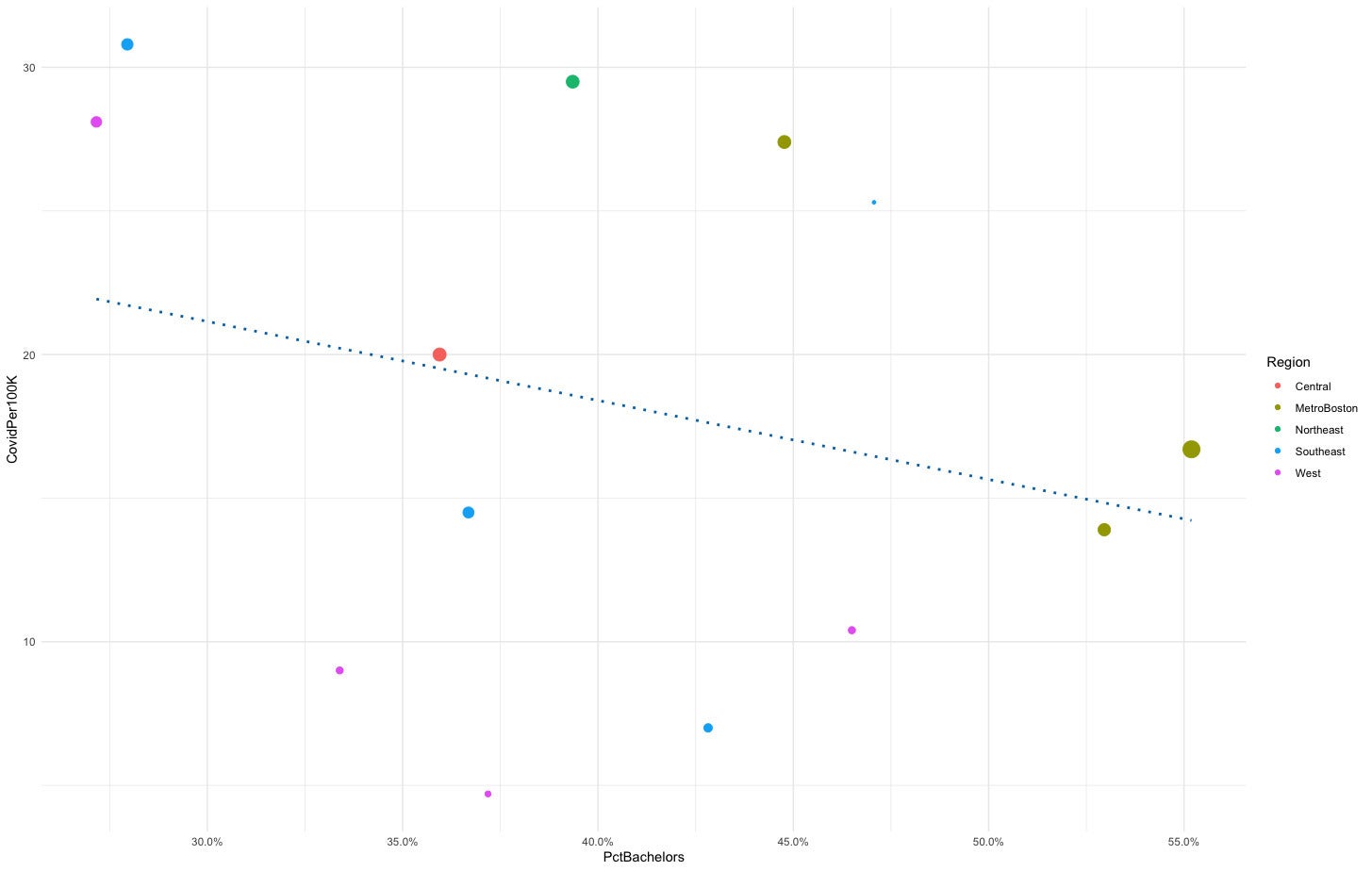 Sharon Machlis, IDG
Basic scatter plot with ggplot2.
However, it’s currently impossible to know which points represent what counties. ggplot’s geom_text() function adds labels to all the points:
ma_graph +
geom_text(aes(label = Place))
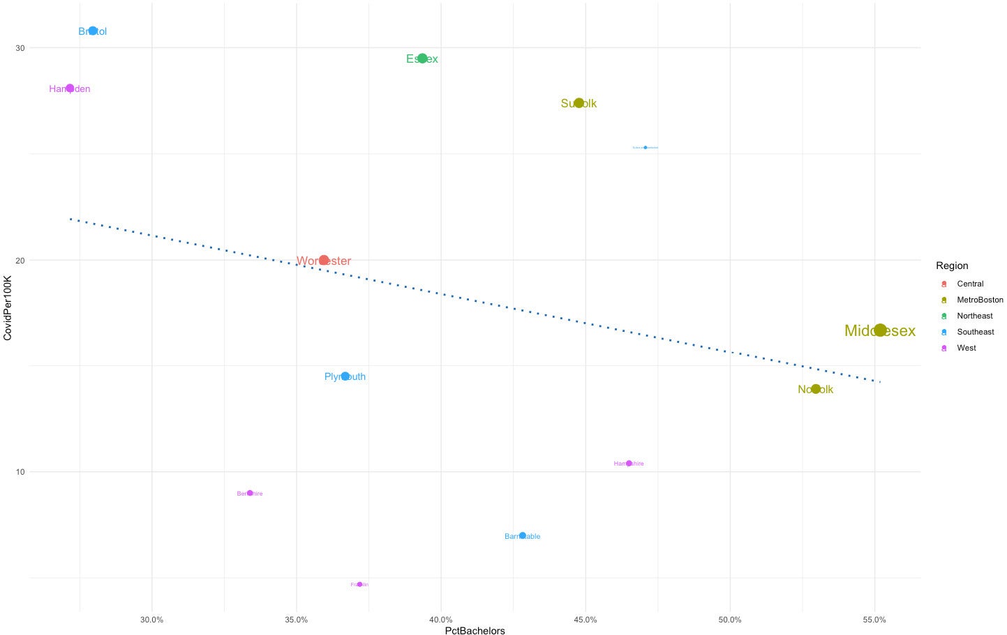 Sharon Machlis
ggplot scatter plot with default text labels.
geom_text() uses the same color and size aesthetics as the graph by default. But sizing the text based on point size makes the small points’ labels hard to read. I can stop that behavior by setting size = NULL.
It can also be a bit difficult to read labels when they’re right on top of the points. geom_text() lets you “nudge” them a bit higher with the nudge_y argument.
There’s another built-in ggplot labeling function called geom_label(), which is similar to geom_text() but adds a box around the text. The following code using geom_label() produces the graph shown below.
ma_graph +
geom_label(aes(label = Place, size = NULL), nudge_y = 0.7)
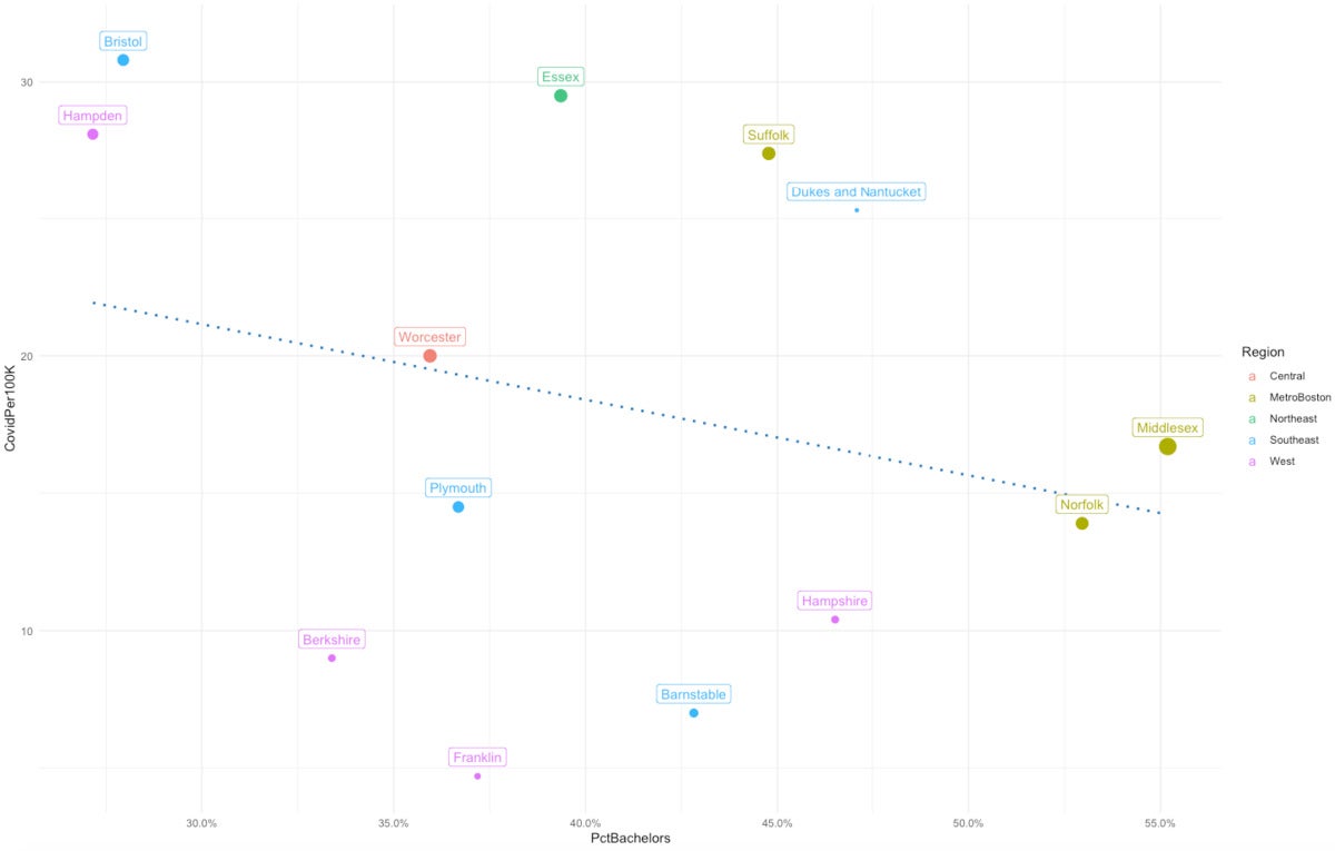 Sharon Machlis, IDG
ggplot scatter plot with geom_label().
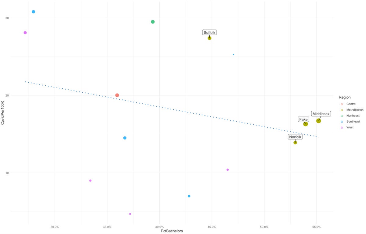
These functions work well when points are spaced out. But if data points are closer together, labels can end up on top of each other — especially in a smaller graph. I added a fake data point close to Middlesex County in the Massachusetts data. If I re-run the code with the new data, Fake blocks part of the Middlesex label.
ma_graph2 <- ggplot(ma_data_fake, aes(x = PctBachelors, y = CovidPer100K, size = AdultPop, color = Region)) +
geom_point() +
scale_x_continuous(labels = scales::percent) +
geom_smooth(method='lm', se = FALSE, color = "#0072B2", linetype = "dotted") +
theme_minimal() +
guides(size = FALSE)
ma_graph2
ma_graph2 +
geom_label(aes(label = Place, size = NULL, color = NULL), nudge_y = 0.75)
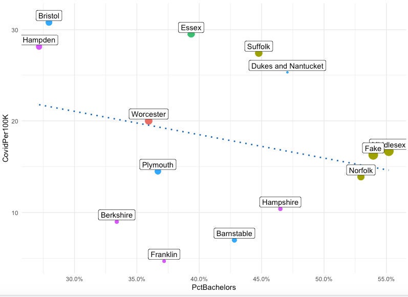 Sharon Machlis, IDG
ggplot2 scatter plot with default geom_label() labels on top of each other
Enter ggrepel.
Creating non-overlapping labels with ggrepel
The ggrepel package has its own versions of ggplot’s text and label geom functions: geom_text_repel() and geom_label_repel(). Using those functions’ defaults will automatically move one of the labels below its point so it doesn’t overlap with the other one.
As with ggplot’s geom_text() and geom_label(), the ggrepel functions allow you to set color to NULL and size to NULL. You can also use the same nudge_y arguments to create more space between the labels and the points.
ma_graph2 +
geom_label_repel(data = subset(ma_data_fake, Region == "MetroBoston"),
aes(label = Place, size = NULL, color = NULL), nudge_y = 0.75)
 Sharon Machlis, IDG
Scatter plot with geom_label_repel().
The graph above has the Middlesex label above the point and the Fake label below, so there’s no risk of overlap.
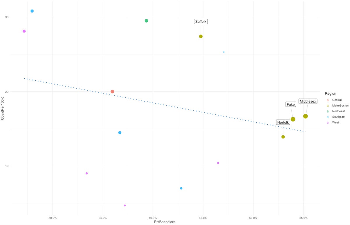
Focusing attention on subsets of data with ggrepel
Sometimes you may want to label only a few points of special interest and not all of your data. You can do so by specifying a subset of data in the data argument of geom_label_repel():
ma_graph2 + geom_label_repel(data = subset(ma_data_fake, Region == "MetroBoston"),
aes(label = Place, size = NULL, color = NULL),
nudge_y = 2,
segment.size  = 0.2,
segment.color = "grey50",
direction     = "x"
)
 Sharon Machlis, IDG
Scatter plot with only some points labeled.
Customizing labels and lines with ggrepel
There is more customization you can do with ggrepel. For example, you can set the width and color of labels’ pointer lines with segment.size and segment.color.
You can even turn label lines into arrows with the arrow argument:
ma_graph2 + geom_label_repel(aes(label = Place, size = NULL),
arrow = arrow(length = unit(0.03, "npc"),
type = "closed", ends = "last"),
nudge_y = 3,
segment.size  = 0.3
)
 Sharon Machlis, IDG
Scatter plot with ggrepel labels and arrows.
And you can use ggrepel to label lines in a multi-series line graph as well as points in a scatter plot.
For this demo, I’ll use another data frame, mydf, which has some quarterly unemployment data for four US states. The code for that data frame is also on page 2. mydf has three columns: Rate, State, and Quarter.
In the graph below, I find it a little hard to see which line goes with what state, because I have to look back and forth between the lines and the legend.
graph2 <- ggplot(mydf, aes(x = Quarter, y = Rate, color = State, group = State)) +
geom_line() +
theme_minimal() +
scale_y_continuous(expand = c(0, 0), limits = c(0, NA))
graph2
 Sharon Machlis, IDG
ggplot line graph.
In the next code block, I’ll add a label for each line in the series, and I’ll have geom_label_repel() point to the second-to-last quarter and not the last quarter. The code calculates what the second-to-last quarter is and then tells geom_label_repel() to use filtered data for only that quarter. The code uses the State column as the label, “nudges” the data .75 horizontally, removes all the other data points, and gets rid of the graph’s default legend.
second_to_last_quarter <- max(mydf$Quarter[mydf$Quarter != max(mydf$Quarter)])
graph2 +
geom_label_repel(data = filter(mydf, Quarter == second_to_last_quarter),
aes(label = State),
nudge_x = .75,
na.rm = TRUE) +
theme(legend.position = "none")
 Sharon Machlis, IDG
Line graph with ggrepel labels.
Why not label the last quarter instead of the second-to-last one? I tried that first, and the pointer lines ended up looking like a continuation of the graph’s data:
 Sharon Machlis, IDG
Line graph with confusing label pointing lines.
The top two lines should not be starting to trend downward at the end!
If you want to find out more about ggrepel, check out the ggrepel vignette with
vignette("ggrepel", "ggrepel")